
Client Portal for the Insurance Intermediary: What Works, What to Avoid and Why Many Fail
The client portal is the point where the intermediary's digitisation becomes visible to the end client. Yet most portals are barely used, if at all. The difference between a reserved area that generates value and one that stays idle comes down to a few fundamental design choices.
The client portal is the intermediary's digital face, yet almost always the least cared-for
When people talk about digitising an insurance agency or brokerage firm, attention naturally ends up on the internal tools: management systems, claims platforms, deadline automation. These are concrete, measurable efficiency levers, and we have discussed them in other pieces in our Journal. There is, however, another element that deserves dedicated thought, and that is often handled badly: the client portal, that is, the reserved area where the policyholder logs in to view their policies, receive documents, check deadlines and open a claim.
It is the only part of digitisation the client actually sees. Everything else is invisible: the client does not know whether you manage cases with an Excel spreadsheet or an advanced vertical system, does not know how long you take to retrieve a document, cannot tell orderly archiving from chaotic. The portal, by contrast, is on show. It works or it does not. It is clear or it is confusing. The client opens it gladly or avoids it. And precisely because it is the only visible element, it carries a disproportionate weight in how professional the intermediary is perceived to be.
Yet, paradoxically, it is also the worst-designed part. Most client portals distributed to intermediaries — when they exist — are rarely used, abandoned after the first login, or remembered only when the client cannot reach the intermediary directly. Understanding why this happens is the first step toward building something that really works.
The scenario: a client who expects self-service but doesn't find it
The context a client portal fits into today is radically different from ten years ago. The average client — private individual or small business — is used to fluid digital interfaces thanks to home banking, courier apps and e-commerce platforms. When they log into the reserved area of an insurance intermediary, they bring those expectations with them.
Market data confirms the trend. According to a study by Accenture, 60% of Italian consumers would like a multichannel customer experience to interact with their insurer through any means, physical or digital, and 50% would like immediate access to the company when needed, including via mobile device. These figures concern the insurers, but they reflect the end client's behaviour in dealing with the intermediary too, who is often the first real point of contact.
On top of this comes the Italian regulatory framework. Legislative Decree 209/2005 (the Private Insurance Code) and IVASS Regulation 40/2018 impose precise obligations on the intermediary regarding informational transparency, document retention and traceability of communications with clients. A well-designed client portal is not just a service: it is a compliance asset, because it centralises the delivery of pre-contractual and contractual documents, logs access, and tracks interactions.
The problem is that many intermediaries come to the client portal by the wrong route: either they accept what the mandating insurer provides (with huge personalisation limits and the insurer's logo far more visible than their own), or they adopt a generic white-label solution designed for hundreds of intermediaries, or they postpone the whole topic to "when we have more time". In all three cases, the end result is similar: a portal the client does not feel is their own, and which after two or three logins they stop using.
Why most portals fail: three recurring mistakes
Observing the portals distributed to Italian intermediaries, three types of mistake emerge that recur with surprising regularity. They are worth naming, because avoiding them is already half the work.
Mistake 1: designing for the technician, not the client
A client portal is not a management system. It sounds like a banal observation, but it is constantly violated. Many portals are born as a "simplified front-end" of the internal management system: same logic, same terms, same structure, just with a few hidden fields. The result is an interface that speaks the intermediary's language, not the client's.
The average client does not know what an "elementary line" is, cannot tell an "endorsement" from a "policy schedule", does not understand why a policy appears "suspended" when they have just paid the premium. A portal that uses technical terminology without explaining it becomes, paradoxically, a tool of misinformation. The client logs in, does not understand what they are looking at, and phones. Exactly the opposite of the operational saving the portal is supposed to generate.
Mistake 2: too many features, none actually used
There is an insurance version of a law well known in digital design: the more features you put into an interface, the fewer of them get used. "All-in-one" portals — with dashboards full of widgets, charts on personal portfolio performance, sections for simulated advice, calculators, comparators — almost always end up in the drawer. The client logs in once, feels overwhelmed, and goes back to phoning their intermediary for the thing they actually needed.
The operational reality of an insurance client is simple and focuses on a few moments: seeing which policies are active, knowing when they expire, downloading a document, reporting a claim, updating a personal detail. Everything else is noise. An effective portal does very few things, but does them well and immediately.
Mistake 3: no visual identity for the intermediary
This is perhaps the most underestimated point. Many portals are blatantly white-label: same interface, same colours, same logo of the technology provider, with the agency's or broker's name relegated to a corner. Logging in, the client perceives that they are using "someone else's portal" — and this feeling undermines the exclusive relationship the intermediary has built offline.
The client portal, on the contrary, should be a natural extension of the intermediary's brand. The agency's logo at the top, colours consistent with existing communications, possibly the name of the reference adviser always visible. These are details that cost little at the design stage but radically change the perception of whoever uses it: it is not "a generic portal", it is "my portal, provided by my intermediary".
What is really needed: the features that make the difference
If the mistakes to avoid are clear, it is worth turning the discussion around and thinking about what a client portal must actually offer to be used. Three principles guide correct design: essentiality, continuity with existing channels, a clear identity for the intermediary.
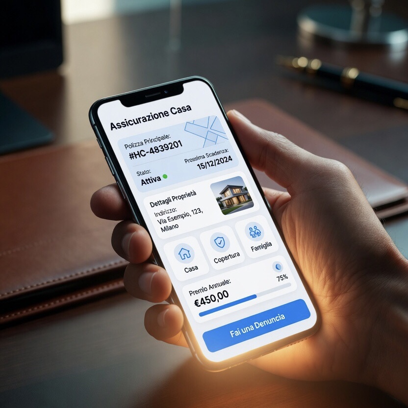
On the feature front, the areas that really matter are few and well defined. Viewing active policies is the starting point: the client must be able to see, at a glance, the list of their cover, with descriptions in understandable (not jargon) language, the annual premium, the expiry date and the ability to download the contract document. A complex analytical view is not needed: clarity is.
Deadline management is the second critical area. A client who receives a renewal reminder by email or message, and can confirm or request information with a click on the portal, has an experience worth ten times the same communication made by phone call alone. If the portal is connected to the intermediary's deadline-automation system — a topic we explored in a dedicated article — the flow becomes seamless: the client sees in advance what is expiring, receives the reminder on their preferred channel, confirms or asks to speak with the adviser.
The document area is the third pillar. All contract documents, premium receipts and IVASS-compliant communications must be archived and consultable by the client at any time. This is not just a service: it is a traceability obligation the intermediary must guarantee under Article 56 of IVASS Regulation 40/2018. A portal that centralises this function turns a regulatory burden into a perceived service.
Claims filing, finally, is the feature that separates a "decorative" portal from an "operational" one. Allowing the client to report an event, upload photos and documents, receive a case number and follow its progress is what makes the portal a genuinely used tool — because it steps in at the moment of maximum relevance in the insurance relationship.
To these are added supporting features: updating personal data, managing privacy consents, the ability to request an appointment or a quote for new cover. The point is that each of these functions must be designed starting from the client's real flow, not from the internal organisation of the database.
Integration with the existing management system: the real technical dividing line
There is a technical issue worth addressing openly, because it determines whether a client portal will have value or remain a disconnected island: integration with the management system the intermediary already uses.
Many portals fail not because of interface problems, but because they live in an ecosystem separate from the system the intermediary works with every day. The client opens a claim on the portal, but that report does not reach the intermediary's management system: it has to be copied out by hand. The client updates their phone number on the portal, but in the management system the old one remains. The communication history stays split. In these cases, the portal not only fails to reduce work: it increases it.
The correct approach is to design the portal as a connected vertical microapplication tied to the existing management system, not as a standalone platform. A dedicated microapplication — designed to do a few things and do them well, developed to measure for the intermediary's specific organisation, integrated via API with the management system already in use — solves the problem at its root. Data flows both ways: what the client sees on the portal is always aligned with what the intermediary sees in their own system, and vice versa.
At A126 we have developed exactly this kind of component for insurance intermediaries: vertical microapplications designed to be the "client front-end" of an existing organisation, not a parallel system. The logic is simple: the management system stays where it is, the internal operational structure does not change, but on top of it a layer dedicated to the client is built, with the intermediary's own visual identity and features calibrated to real usage behaviour.
This approach ties directly to the topic of multichannel communication, which we covered in a dedicated Journal article. The portal is not an island: it is the point where multichannel communication (email, SMS, messaging) converges and from which action is generated. A deadline reminder sent by message leads to the portal; a document-available notice arrives by email and concludes on the portal; an assistance request starts from a notification and is formalised in the portal. It is the integration between channels and portal that produces true continuity of service.
The difference between a portal that gets used and one that gets ignored
At this point it is worth drawing a practical summary. In concrete terms, how do you tell whether a client portal is well designed? By five elements that are easy to check.
The first login is simple. The client must be able to log in without calling the intermediary to ask how it is done. Modern authentication systems (first-access link by email, simplified two-factor authentication, automatic password recovery) are by now a basic standard. A portal that requires a technical setup procedure is already lost at the first step.
The home page is readable in three seconds. The client opens the portal and immediately understands what they have (their policies), what is expiring (the nearest dates), what is new (a document to sign, a claim in progress). Without endless scrolling, without hunting through nested menus.
It works perfectly on a smartphone. A large share of access to client portals happens from mobile. An interface that becomes a little ordeal of tiny buttons and unreadable tables on a phone is abandoned after a single attempt. Mobile-first design is not a luxury: it is the basic requirement.
It communicates like the intermediary. The agency's or broker's logo is clearly visible, the name of the reference adviser appears in plain sight, the tone of the automated messages is consistent with what the client hears on the phone. If the portal "sounds like" something other than the offline relationship, something is wrong.
It does not ask the client to do the intermediary's work. A portal that forces the client to categorise their own documents, to choose technical terms from dropdown menus, to fill in forms with fields that could be pre-filled by the management system, is a portal that offloads complexity onto the client. When the portal is well designed, the client feels the tool is working for them, not the other way round.
The portal as proof of the intermediary's digital maturity
The client portal is the insurtech product with the greatest visible impact for the end client. It is also, for this reason, the most severe test of the digital maturity of an agency or brokerage firm. You can have the most digitised back-office in the world, but if the portal presented to the client is confusing, generic or disconnected from the rest, the overall impression remains that of a not-very-modern organisation.
The point, then, is not "whether" to have a client portal, but "how". And the answer has little to do with buying a platform and a lot to do with designing a tool that is consistent with the intermediary's organisation, integrated with existing systems, and recognisable by the client as their own.
At A126 we work in exactly this direction: we design and develop vertical microapplications intended to be the client extension of insurance intermediaries, whether they already have an advanced management system or a heterogeneous operational system to connect. The logic is always the same: the portal must adapt to the intermediary's organisation, not the other way round.
If you are considering setting up a client portal, or if the one you have today is not used as you would like, get in touch for an exploratory consultation: together we will analyse the current setup, identify the points where a portal would really make a difference, and design a solution tailored to your organisation.
A126 Corporate Advisors — Vertical microapplications and bespoke digital solutions for insurance intermediaries.